Gothenburg Font: Adding Raw Edge to Web Layouts
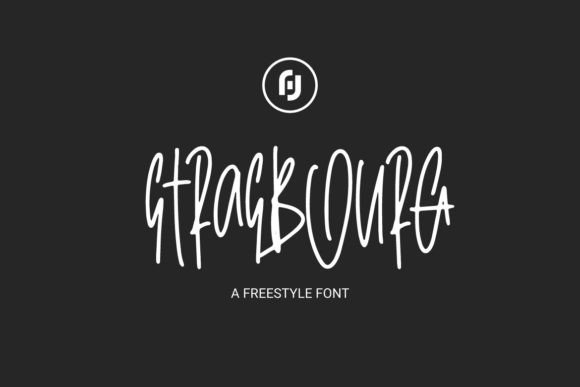
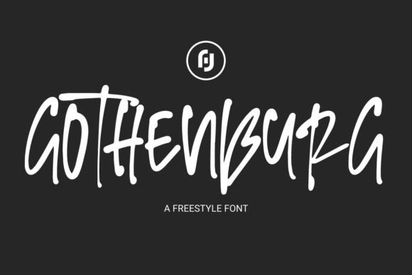
I was staring at a Figma file for a new creative coaching brand last Tuesday, and something felt off. The layout was clean, the color palette was sophisticated, and the imagery was high-quality, but the typography lacked a pulse. The client wanted to convey authenticity and a break from corporate polish, yet my current font selection felt too safe. That is when I decided to test Gothenburg in the hero section. As a display font with a freestyle script aesthetic, it immediately transformed the static mockup into something that felt alive and intentionally imperfect.
Choosing typefaces for digital products is often a balancing act between personality and usability. Gothenburg is not your standard handwritten font; it is a bold, experimental typeface that demands attention. Its irregular baseline and varying stroke weights give it a raw, edgy vibe that works exceptionally well for brands trying to stand out in crowded digital spaces. However, integrating such a distinct script font into a responsive web environment requires careful consideration of hierarchy, readability, and user experience.
Testing Personality Against Usability in Hero Sections
The first place I typically introduce a creative font like Gothenburg is the main headline or hero text. For this specific coaching website project, I replaced a generic sans serif header with Gothenburg to see how it handled the primary value proposition. The result was striking. The font’s rebellious feel added an emotional layer that clean geometry simply could not achieve. It signaled to visitors that this brand was human, approachable, and unafraid to be different.
However, testing also revealed immediate constraints. Because Gothenburg features experimental letterforms and a loose structure, it cannot be treated like body copy. In my initial tests, setting it at smaller sizes caused the intricate details to blur on standard laptop screens. I quickly learned that this premium font performs best when given ample breathing room. Scaling it up allowed the unique character shapes to remain crisp and legible, turning the headline into a visual anchor rather than a readability hurdle.
Navigating Mobile Responsiveness and Touch Targets
Web design is inherently responsive, and a display font must adapt to vertical viewports without breaking the layout. When previewing the site on mobile, I noticed that Gothenburg’s natural flow required adjustment. Script fonts often have wide aspect ratios, which can force awkward line breaks on narrow screens. To maintain the intended impact, I adjusted the CSS to treat the headline as a single graphical element on mobile, ensuring the word spacing remained intentional rather than accidental.
I also strictly avoided using Gothenburg for interactive elements like buttons or navigation links. While it might be tempting to use a stylish script for call-to-action areas to boost engagement, accessibility must come first. Users need to scan buttons instantly, and the decorative nature of this typeface slows down cognitive processing for functional tasks. Instead, I reserved Gothenburg for decorative accents, pull quotes, and section dividers where its artistic flair could enhance the mood without compromising navigation efficiency.
Strategic Font Pairing for Digital Brand Identity
A bold script font never exists in isolation. To make Gothenburg work within a professional web layout, pairing it with the right supporting typeface is essential. For this project, I chose a neutral, geometric sans serif for the body copy. The contrast between the raw energy of Gothenburg and the structured stability of the sans serif created a dynamic visual tension that kept the page engaging. This combination balanced the rebellious aesthetic with the trust and clarity required for a service-based business.
If you are designing for an editorial platform or a boutique online store, you might consider pairing Gothenburg with a modern serif font instead. A serif can add a touch of traditional elegance that grounds the experimental script, making the overall brand identity feel more established. The key is to ensure the secondary font does not compete for attention. Gothenburg is loud; its partner should be the quiet, reliable narrator that guides the user through the content.
- Hero Headlines: Use large sizes (4rem+) to showcase detail and prevent pixelation.
- Body Copy: Avoid entirely; stick to highly legible sans serif or serif families.
- Captions and Labels: Use sparingly for emphasis, never for critical information.
- Logo Design: Excellent for wordmarks where scalability is controlled.
- Social Media Graphics: Perfect for overlay text on Instagram or Pinterest templates.
Technical Considerations for Web Performance
Before committing to any creative font for a live website, checking the technical assets is non-negotiable. I always verify that the webfont files are optimized for fast loading. Display fonts can sometimes be heavy, so ensuring you are only loading the necessary weights and styles is crucial for Core Web Vitals. For Gothenburg, I confirmed the availability of WOFF2 formats and checked the licensing to ensure commercial usage was covered for both the website and associated digital marketing assets.
It is also worth exploring included alternates and ligatures. Many premium script fonts come with OpenType features that allow you to customize connections between letters. In my layout, utilizing these alternates prevented repetitive letter shapes in longer phrases, maintaining the organic, hand-drawn illusion that makes the font so appealing. Taking ten minutes to enable these features in CSS can elevate a design from "using a cool font" to "bespoke typographic art."
Enhancing Visual Hierarchy Without Sacrificing Clarity
The ultimate goal of using a typeface like Gothenburg is to guide the user's eye, not to confuse it. During the design review, I paid close attention to scanning behavior. Did the script font help users understand the page structure, or did it act as visual noise? We found that using Gothenburg for subheadings helped break up long sections of text, creating natural pause points that improved content consumption. It acted as a visual cue, signaling a shift in tone or a highlight within the narrative.
Contrast against backgrounds also played a significant role in readability. On light backgrounds, the dark ink of Gothenburg popped beautifully. However, when testing over photography, I had to apply subtle text shadows or semi-transparent overlays to ensure the irregular strokes didn't get lost in busy image details. Accessibility standards require sufficient contrast ratios, and with decorative fonts, it is better to over-compensate than to risk excluding users with visual impairments.
Incorporating Gothenburg into this project reminded me that web typography is about more than just selecting a pretty typeface. It is about understanding the intersection of art and function. This font brings a undeniable edge and personality to digital layouts, making it a powerful tool for portfolios, campaign landing pages, and lifestyle brands. By respecting its limitations and leveraging its strengths through thoughtful pairing and responsive adjustments, you can create online experiences that feel both professionally polished and authentically human.